
When giving selection criteria examples applying for a government job, proof of your achievements is important.
Proof comes in many forms:
- Case studies
- Statistics/data
- Testimonials
- References
- Projects that are now business as usual
The proof needs to cover that you did what you did, what you say you delivered was delivered, the skills you say you have were displayed and remove any doubt that the claims you are making are not overstated or patently false.
We live in a data/knowledge age
If you have seen any television connected to COVID in the last 18 months, you will have seen statistics. Cases, deaths, vaccination rates, international comparisons, days of lockdown and many many more. A lot of the COVID story revolves around data.
Data makes things real. In life and in criteria examples. The recent upward trend in vaccination rates makes the end of COVID lockdowns real. There is a target there 80%. When 80% happens, these other things happen. It is measurable and tangible; even though it is completely intangible. It’s nothing more than a concept and a return to normal.
Proving your achievements is easily done with data:
- x%’age under budget
- Delivered x weeks ahead of schedule
- x% of customers were satisfied or highly satisfied
- Pass rates improved by x%
- Pass rates reached x%
- $x saved from x number of process efficiencies
- Customer base expanded into new geographic areas in x LGA’s or postcodes
- Insert your own data of choice here
Like COVID storytelling, the numbers make the achievements real and quantified. 1% under budget is good, 20% under budget is better. They’re comparable. If you said to yourself 1% or 20% of what, yes I agree.
Starting a Criterial Examples Arms Race
Risk with quantifying your criteria examples is that you can be beaten. Looking at the 1% and 20% under budget I mentioned above, 1% is a good outcome, 20% is better. If you are the 1% example and you’re competing against the 20% you’re potentially showing as weaker.
Statistics as they say are like nuclear power, they can be used for good and evil.
Once again returning to the previous paragraph 1% or 20% of what also makes a difference. 20% of $1,000 is $200. 1% of $1,000,000 is $10,000. In that case, $10,000 is better than $200 if that is the only metric you look at.
Of course you should look at it all in context and be accurate. That means saying you achieved 20% under a $1,000 budget.
The point here being if you want to base your application and achievements entirely around statistics in your criteria examples, you might be found wanting; especially if you try to portray them in an unrealistic manner.
Data is However Boring
My day job is working with data, analysis and driving business decisions. I have worked in analytics for most of the last 25 years. It is my passion; I love it. I also know when it can go badly wrong. Have a read of this lot I vividly remember from a report many years ago. This is a “Key Results” (read executive summary) from a report into road crashes. Have a read and try and work out what it all means. Try to work out what is the story?
Key results
- 4.7% of mid-block sections have high crash rates and high NetRisk scores.
- 7.4% of intersections have high crash rates.
- Two out of three mid-block sections and nearly three out of four intersections have had no reported crashes in the five years 2004 – 2008.
- In an average year there are about 175 fatal crashes and 2,300 serious injury crashes across the state.
- 40% of crashes occur on high speed roads (100 km/h and above) and one in three occur in 60 km/h roads.
- More than one third of fatal and serious crashes occur at intersections, one in four are run-off-road type crashes, 15% are rear end crashes and 7.6% are head-on’s.
- 13% of fatal/serious casualties are motorcyclists while 7% are pedestrians or cyclists.
- 39% of all fatal and serious injury crashes involving motorcycles occur at intersections. 17.6% are run-off-road (11.3% hit object), 14.9% are out-of-control crashes and 11.2% are rear-ends.
- North West region has the highest crash rates: 128 fatal and serious crashes per billion vkt and 10.1 fatal crashes per 100,000 population.
- Metropolitan region has only 1.4 fatal crashes per 100,000 population but it has the most fatal and serious injury crashes (2,375 in five years) of any region.
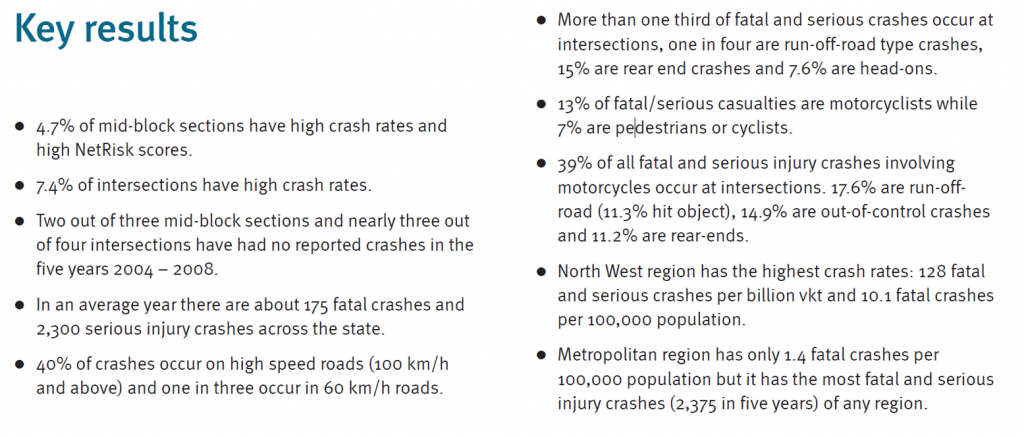
What does that all say? Any idea? Me either.
The Struggle is Real
It is painful to read. It is death by statistic and to make it worse, it constantly mixes expressions like:
- Two out of three, two thirds, 66.6% – which makes it harder to read as the reader is trying to understand different terms.
- Some lines contain five statistics “39% of all fatal and serious injury crashes involving motorcycles occur at intersections. 17.6% are run-off-road (11.3% hit object), 14.9% are out-of-control crashes and 11.2% are rear-ends” and even though all expressed as a numerical percentage, there is no common theme or apparent meaning i.e. no story.
- Percentages in decimal places, although accurate, do not add to the story. Regards whether the statistic is 33.78% or 33.8% or 33% or 35% or 31.5%, when you’re telling a story, they’re all the same thing – about a third!
- Some of the statistics describe almost all a data set but not quite:
- 40% of crashes occur on high speed roads (100 km/h and above)
- One in three occur in 60 km/h roads.
- Deduction tells me the other almost third (I did that to make it harder to read and show why you shouldn’t mix terms) happen either in between 60-100, or, lower than 60% but I’ll never know!
If you’re describing most of a data set, describe the whole data set.
Choose Your Own Adventure
Another thing these randomly collated statistics in criteria examples don’t do is tell a story. For the “key results” type summary you want to tell the reader the story. This many statistics especially in a high-level summary really leaves it open to the reader to choose their own adventure and what the story is.
For a selection criteria-based job application you also want to tell the story. That story being about you. The story needs to talk about your skills, your passion, your achievements, your values and why you are the best person for the job.
You do not want the selection panel trying to work out who you are from different incidental bits of information about you.
Data and Graphs in Criteria Examples are the same thing
Any reference in this discussion to data or statistics in criteria examples, includes graphs.
You can show a lot of information in a graph, and very easily overwhelm someone trying to get the story.
The more lines and columns or rows, labels, colours, axes, exploded pie sections etc you have; the less it says. And colour does not make up for lack of content.
Complex graphs have a place; it is not with someone trying to get a high-level story or idea of what is going on.
Even something as simple as removing a data set takes a graph from:
There’s a lot going on here…
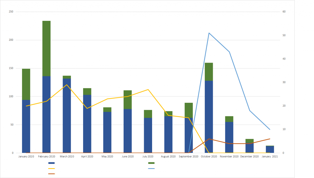
To…something changed in September 2020 that made one thing stop and two new things to start.
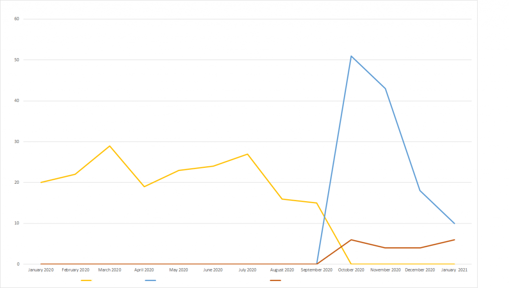
You can see the story plain as day in the second example without all the visual noise and distraction.
The message in that? Apply the KISS principal:
- Keep
- It
- Simple
- Stupid
Your aim in criteria examples is to tell a story, not give a statistical dissertation of two years of PhD research.
What Is the Story from Telling this Story about Data in Criteria Examples
Data doesn’t tell the story.
I have read applications that contain dozens and scores of statistics. I’ll take them as read they are proof of outcomes, but I want to know the story. As I say throughout these blogs and my online training courses, it is your job to tell me the story, to sell yourself and tell me why you are the best for the role. Yes achievements are important in a role and yes that can be shown in statistics but it is a very one dimensional story.
As I discuss in the Join Selection Criteria Accountabilities to see who They Want blog, having “all the skills” for a role is one thing, but, being the person who will be a good fit for the team and the business is another. That is the story you need to tell.
Have statistics for sure but keep them relevant, short, succinct and make sure you tell the reader about who you are, how you achieved them, your skills and attitudes because that is the person they are looking to employ.